The following images are produced by connecting the weather_table from MS SQL Server with Tableau and visualizing the data without any actual querying:
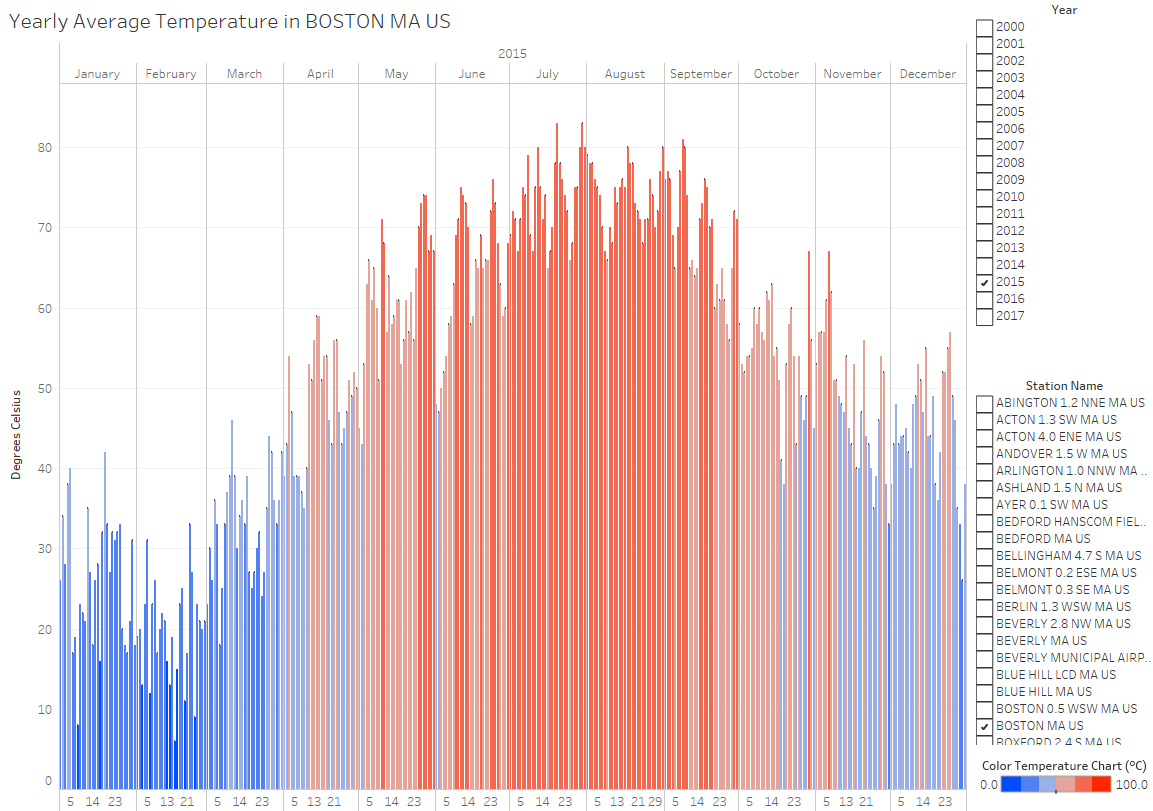
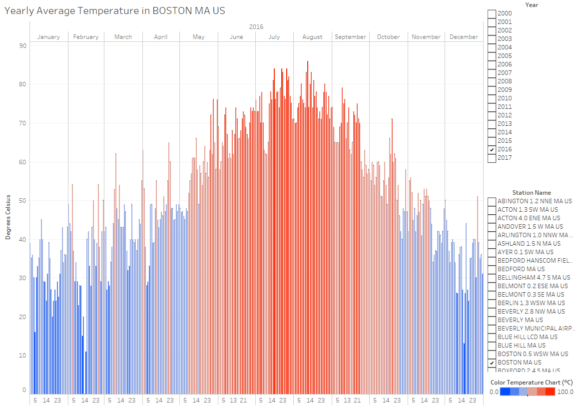
1) Comparing daily average temperatures in Boston between 2015 and 2016:


When you compare the temperatures of February and March of 2015 with the temperatures of February and March of 2016 you will begin to see spikes of warm temperature in 2016 on days with recorded temperatures that were not present in 2015 ranging from 55-65 degrees Celsius from those months in 2016. This is purely anecdotal but I was initially curious because I recalled experiencing unseasonably warm weather on days during late winter.
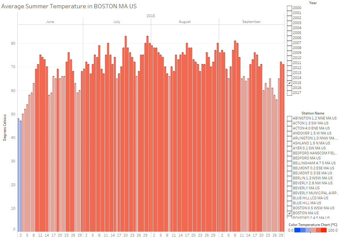
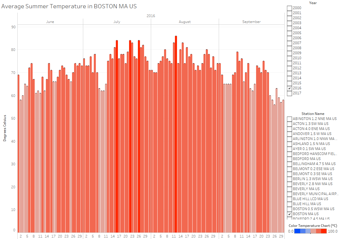
2) Comparing daily average temperatures in Boston during the months of June to September 2015 with June to September 2016 (smaller scope):


The differences I discern between the two graphs are the lack of colder temperatures as denoted by the sky-blue color, which are any temperatures ranging between 33.32 - 49.98 degrees Celsius, and the spotted presence of hotter temperatures, which are any temperatures ranging above 83.33 degrees Celsius, as denoted by the deep red color. Furthermore, these changes are easily visible to see than comparing the daily temperatures on an annual scale.