This is a revisiting to one of my earlier projects using names from the Social Security Administration database but now you can interact by manipulating certain filters such as the year slider or searching for specific names, states, and gender.
Link to my interactive Tableau workbook here.
How to read and use dashboard:
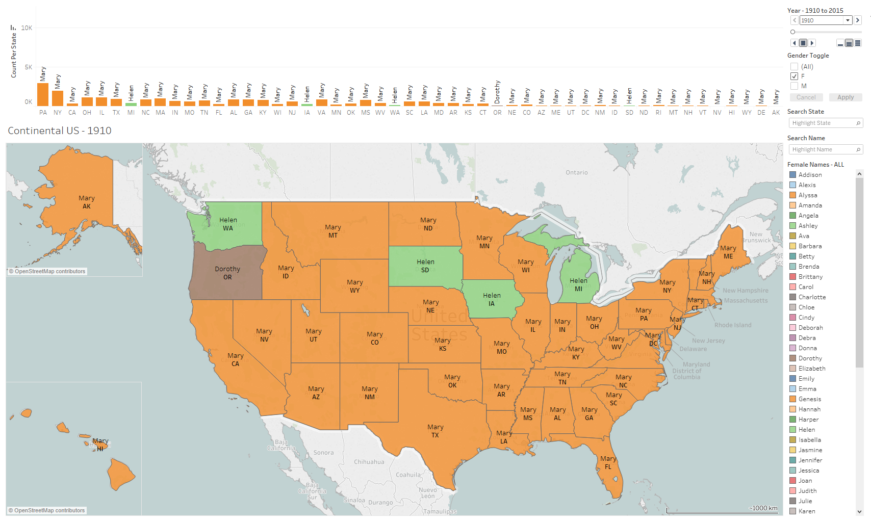
The top graph below denotes the total count of top name by state on the y-axis with the list of states and territories on the x-axis.
The colors correlate to a specific name on the graph and on the geographical map and are not reused for the duration between the years 1910 to 2015. The color denotations correlate to the active gender filter and the composition, e.g., male, female, or both. As you may notice, the animated trends below reuse the same color palette since I animated the map solely by gender exclusivity, i.e., female or male, and not both at once. If you were to toggle both genders, from the top right-side panel, then that would give you the top names by count while ignoring gender and necessitating an expanded color palette to distinguish all the included names.
Example: The color green on the map below represents Helen and during 1910 this female baby name was most popular amongst states such as Washington, South Dakota, Indiana, and Michigan with a recorded count of 156, 60, 249, and 368 respectively.
Additionally, you can hover over the states to get an exact count of the recorded name or refer to the above bar graph for a rough estimate.
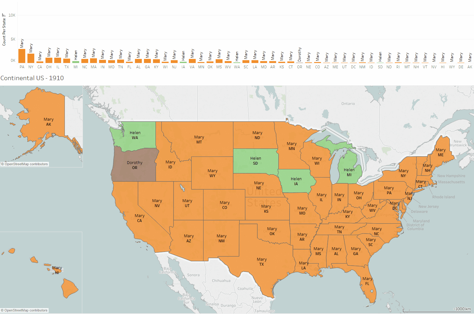
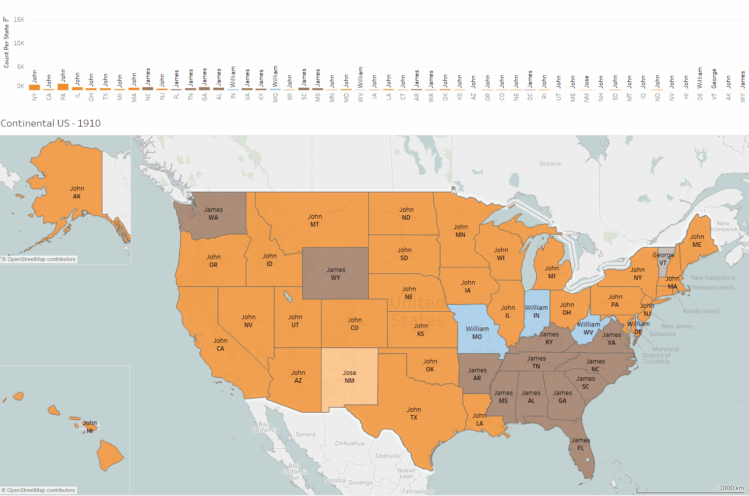
Furthermore, I made a .gif to show the all correlative popularity changes of a name among several states and it was interesting to see name staples envelope large regions of the country and its inverse as the name staple becomes increasingly uncommon as years progress.
Female name trends from 1910 to 2015:
Male name trends from 1910 to 2015:
Questions concieved after project:
1) What internal or external factors determine the rise and fall of a name's popularity?
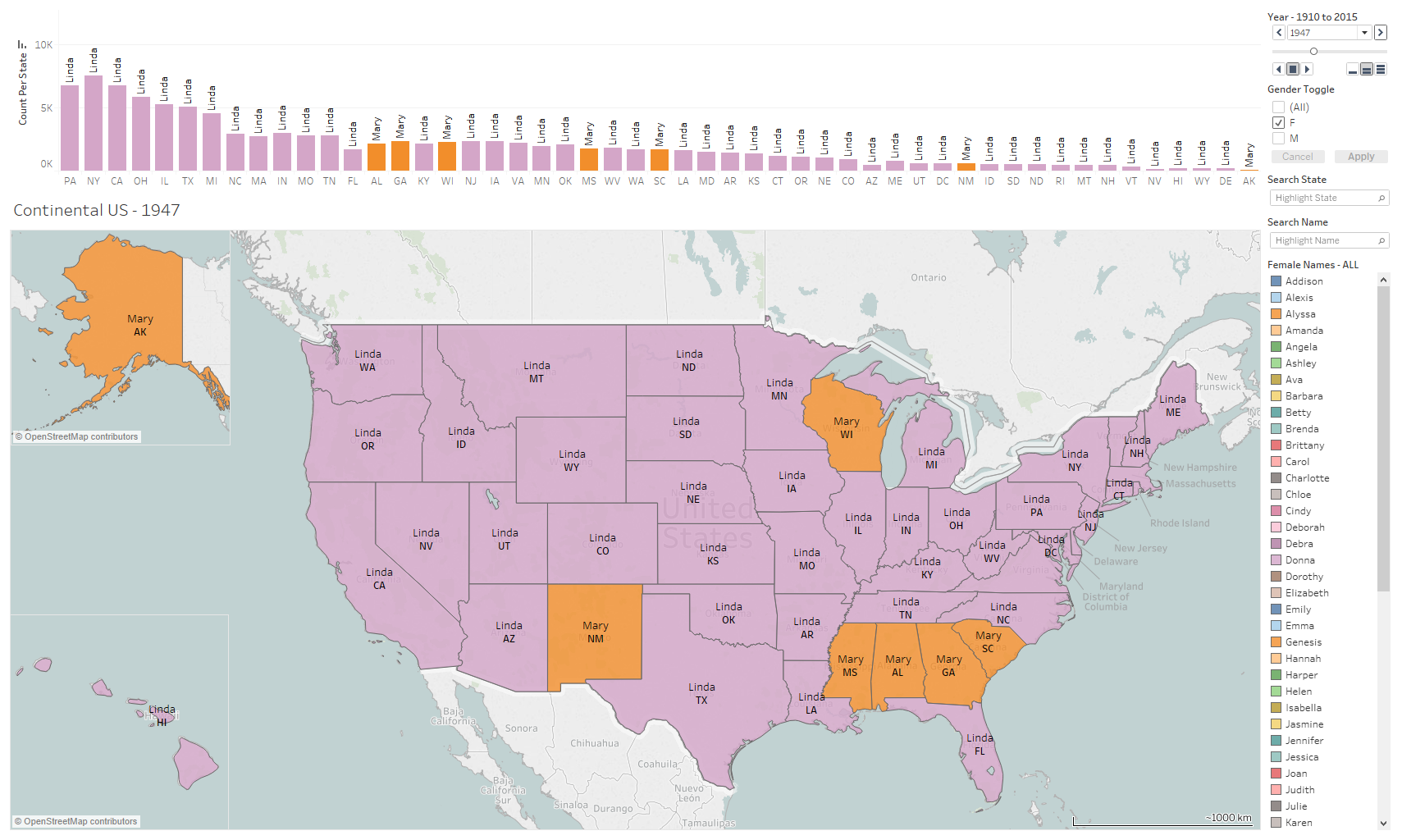
An example being are the names Linda and Mary during 1947 for which Linda became the most popular name with an 86% overall country coverage while the name Mary persists with a 14% overall country coverage as represented by the seven orange remaining states.
Country coverage is what I referred to the ratio of tallied names per state distributed among the 51 states (i.e., Mary can be counted to be a top name for 7 states so we can do 7/51 = 0.137 %). Of course, this does not consider the population size for each respective state but this number merely stands for a tangible figure for easier comparison.
Was there a prominent cultural figure that influenced new and budding parents to consider Linda and Mary among the list of prospective names for their newborn?
Anecdotally I recalled reading this HuffPost article from 2015 where the HBO's Game of Thrones' meteoric rise to fame coincidentally resulted in 241 babies being named Khaleesi who is one of the pivotal female characters from the medieval fantasy drama. It is amazing and equally odd to witness how our daily hobbies and activities can influence the naming decision for a child.
Another interesting question to ponder is what type of influence or behavior is contributing to the wide acceptance of a baby name and how does a singular name or even groups of different names appear in small swaths of states and again in larger regions on the opposite side of the country?